Pinaki Sarkar
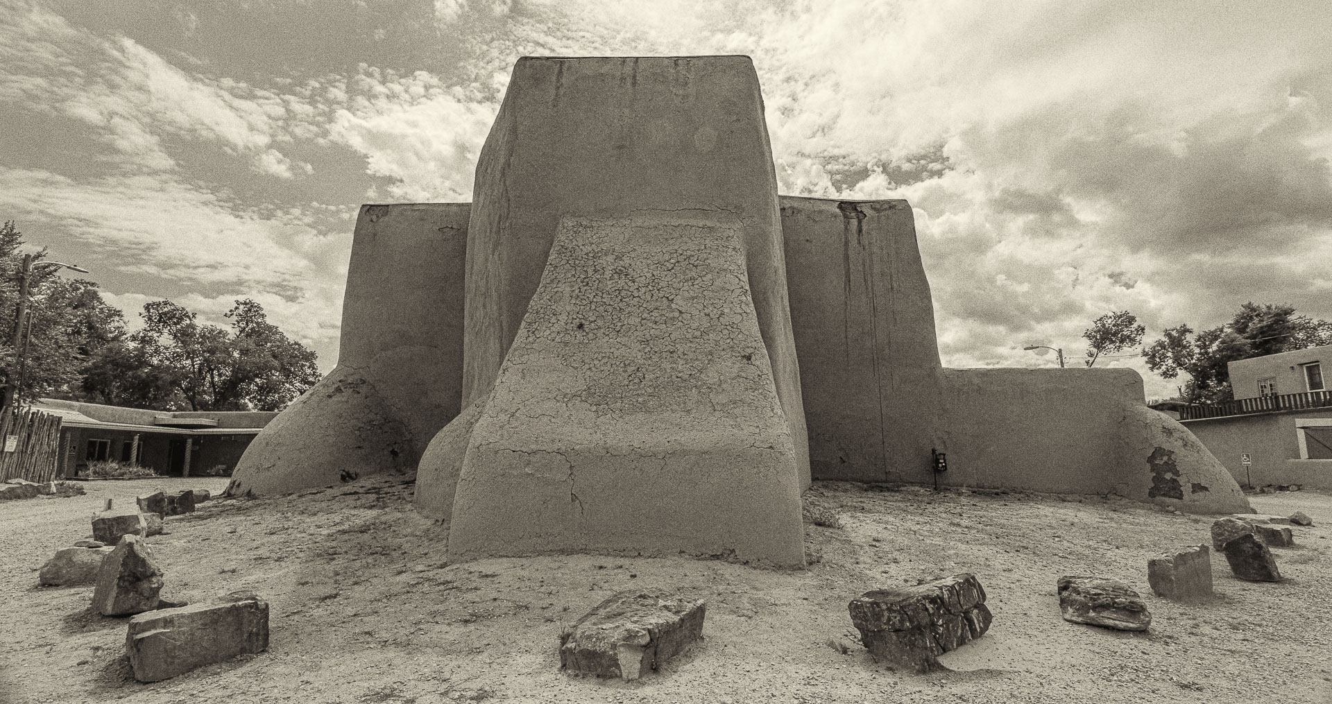
October 2025 - San Francisco de Asis Church (or St. Francis Church), at Ranchos de Taos, New Mexico. (the Back)
About the Image(s)
Technical:
F11,1/100,ISO 90,14mm, Processed through Lightroom and Nik Collection . Shot Handheld
Background:
It is an 18th-century adobe church and a classic landmark.
Some people say it is the most photographed and painted church in United States.
I do have a color version but it seemed to me the B&W looked better because of balanced proportional simplicity of the architecture.
9 comments posted
Kenneth Taylor
Intersting! I never would have guessed that this was a church! I would adjust the soil contrast so that it sepertes the church and make it stand out. Posted: 10/08/2025 14:46:23
Hello Pinaki . . . One advantage of Black and White Photography is the ability to enhance the sense of depth . . . especially with respect to textures. One option would be for you to increase the contrast on the building facade to enhance the "grittiness" of the wall surfaces. Another consideration would be to enhance the "Architectural" aspect of the church. In part, this has to do with portraying the building as it would be interpreted by human vision. This includes portraying the geometry of the scene accurately. It appears you tilted your camera upwards slightly creating converging "vertical" edges. By maintaining the vertical edges of the structures to the very right and left of your scene, the more ideal result would emerge. This would require you to either back up or use a wider angle lens or turn you camera to a "portrait" position, or a combination of those three options. Another option would be to correct the geometry in software. Posted: 10/08/2025 15:47:32
Yes. As mentioned I used Wide 14mm and walked close to the structures to bend and to curve the perspective. I never intended to be representation of a reality , rather my interpretation and dramatization of it.
I have seen photographs of this very same structure with medium format camera and subsequently cropped. Technically, from the perspective point it is correct but has a different feel to it.
Question is what do we want ? How does it appeal to us ? In all cases I found that this architecture has a unique architecture balance. Posted: 10/10/2025 17:05:04
It looks like the image was taken during mid-day as the light seems to be quite harsh. Technically the image has been taken using appropriate specs. It might work to use the transform tool in photoshop to correct the perspective as you can see the lamp post on the left of the image is leaning inwards. A human element would also enhance the image. Try black and white instead of sephia and compare both to see which one looks better. Posted: 10/08/2025 16:55:08
Yes. It was taken during midday. I didn't have the luxury to take photos and explore the place in the golden hours. Nor did I want to .
As mentioned I used Wide 14mm and walked close to the structures to bend and to curve the perspective. I never intended to be representation of a reality , rather my interpretation and dramatization of it.
I have seen photographs of this very same structure with medium format camera and subsequently cropped. Technically, from the perspective point it is correct but has a different feel to it.
Question is what do we want ? How does it appeal to us ? In all cases I found that this architecture has a unique architecture balance. Posted: 10/10/2025 17:08:40
Thank You very much. Excellent editing . Posted: 10/20/2025 18:24:55
Hi Pinaki. I think you are right to explore a different look given that this has been photographed so many times, including famously. I think the ultra wide approach is fine, but with the adobe structure so curved to begin with, the effect is not obvious to me. Maybe that is a good thing? It does force you to bring in more background on the sides (to keep the whole church in the frame) than a longer lens would, and I think the additional background does not add anything - perhaps is distracting.
I think the bigger thing you might think about is the fact that there are a lot of bright areas in the frame that attract the eye, and none of them is the subject. The sky in particular is much brighter and eye grabbing than the church, and the foreground is as well. The tonality in the church right now is a bit bland by comparison. So I might due some significant dodging and burning to try to make the church more of an attraction. I took one cut at that below. I also cropped a bit to minimize the background.
I am not sure what you mean by finding "that this architecture has a unique architecture balance". But as you say, the question is how does it appeal to us. Your view on that could be different than mine or the next person, so my edit could easily push against what appeals to you.
Hope that is somewhat helpful. Posted: 10/17/2025 12:54:57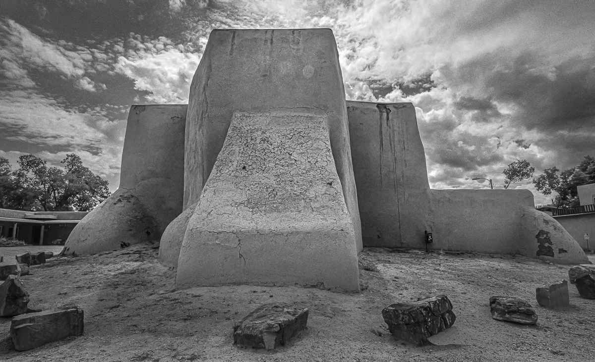
Jim Williams
Pinaki, your responses to the comments raise an excellent point in general about the efficacy of the type of feedback this forum provides. At the end of the day we, as artists, are trying to say something. That something can speak to the artist and literally no one else, and that should be okay. The question I have for you is whether YOU feel you have achieved what you were setting out to achieved, or if you feel that there is either something missing or that the image didn't live up to your intent? If so, what would you like feedback on? Is it composition, style, or something else entirely. Either way, I will try, in my observations to not remake your art to fit my style, or what I'd do in your shoes. I'll also apologize if my suggestions fly in the face of your desired intent. So here are my observations:
The image seems flat to me. While the sky seems to have most luminosity zones accounted for, the fore and mid ground don't.
I find the buildings to either side to be distracting, but also provide a level of contrast in architectural style. To resolve this would likely take some trial and error, or may be fine left alone.
The noise in the sky can show a desired grittiness, or could be corrected to some degree in processing.
There seems to be either a flare or sensor spot in the top middle on the church. Effect or distraction?
Good luck :) Posted: 10/18/2025 13:58:15
Good Points. Thanks.
"I find the buildings to either side to be distracting": I deliberately kept them to add a time stamp to the photograph. As you know this is a famous place and has been photographed famous American photographers of the past. Posted: 10/20/2025 18:24:07
"I find the buildings to either side to be distracting": I deliberately kept them to add a time stamp to the photograph. As you know this is a famous place and has been photographed famous American photographers of the past. Posted: 10/20/2025 18:24:07