About the Image(s)
Here in New England it seems everyone has been saying that this year will be a terrible year for fall foliage. Temperatures and rainfall have not lined up to produce the show that New England is known for. So I ventured up into the mountains of NH last week with limited expectations.
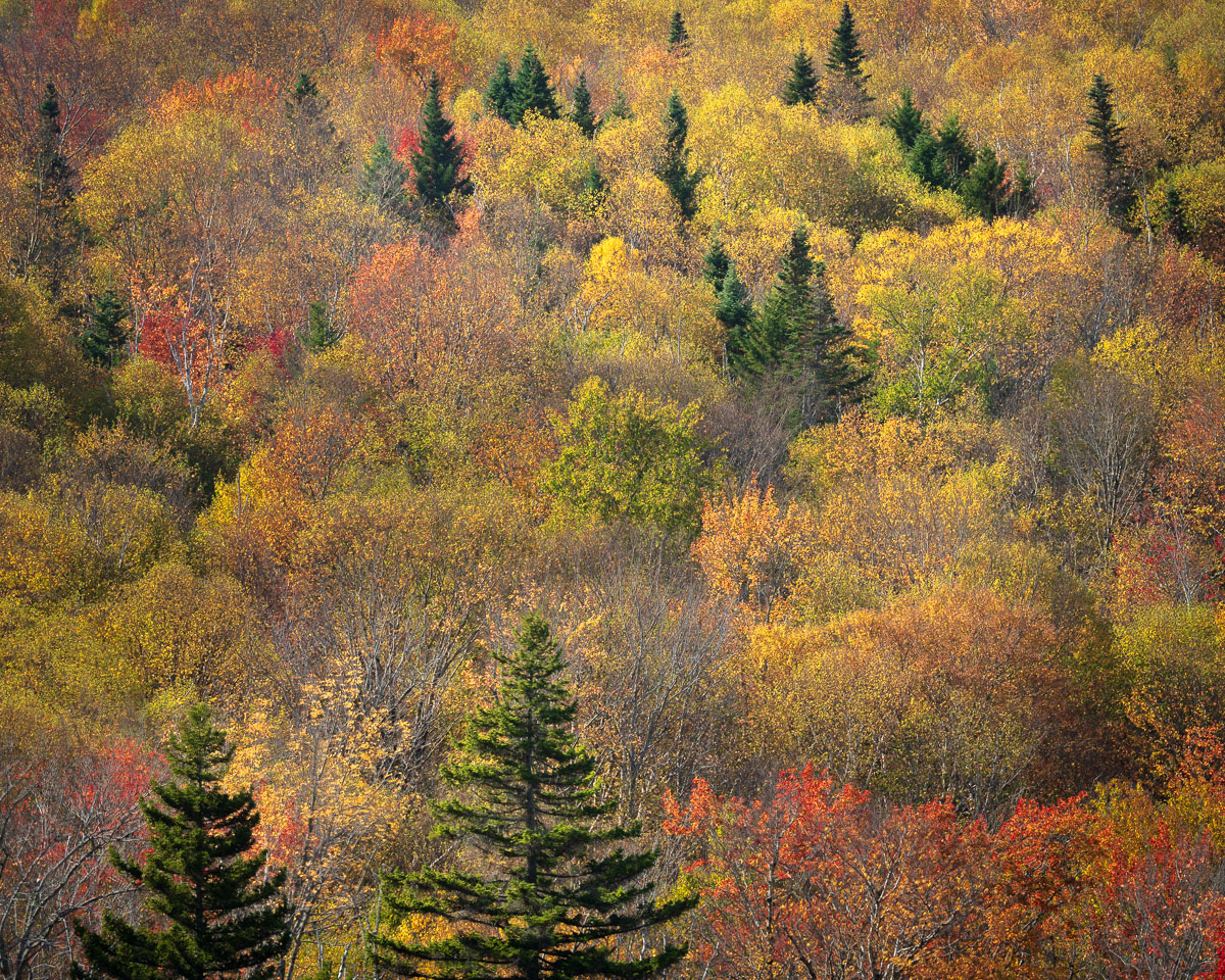
Perhaps I am not a connoisseur of fine leaves, but what I found did not disappoint. This month's image is captures some of that autumn glory. It was taken with a telephoto to isolate the colors and patterns on a hill positioned across a pond. I like this more abstract rendering vs. wider shots that include the pond or sky (which was a clear bright blue). I love the juxtaposition of the evergreens against the colored leaves. The trick was to find a pattern of this that seemed interesting. Thoughts on how well I did with that are welcome.
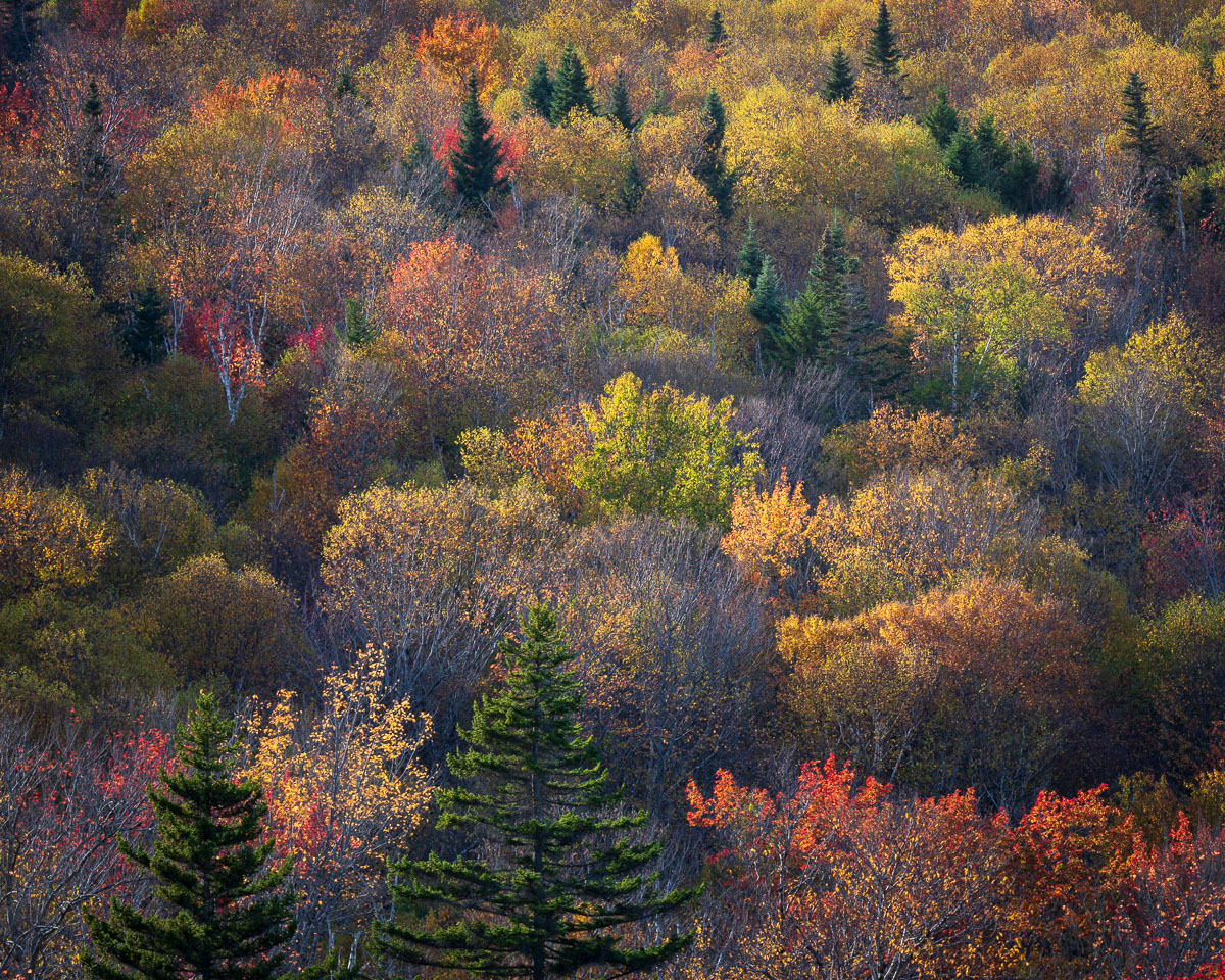
I included a second shot of roughly the same framing but taken later when I came back to this spot with the sun descending behind the hill. I love this geometry because the hill eventually shadows much of the vegetation except the tallest pieces which get brilliantly lit by the low angle back/side light. But this gives a very different look than the first image. The second one is more about the light vs. the first which is about the patterns. I'd appreciate thoughts on which people feel is the stronger image.
Sony a1, FE 70-200 f2.8 II, 1/30 sec, f8, ISO 100, 200mm, focus stack of two images.
Kenneth Taylor
I like your image, very colorfull. The trees seem to dominate the image. I think slightly saturating the yellows and reds to bring out the colors more. Posted: 10/08/2025 14:53:58

Robert Atkins
Thanks Kenneth. When you say the trees dominate, you mean the evergreen ones? I will try dialing up the red's and yellows and see if that balances things a bit more. Posted: 10/17/2025 15:53:43

Rick Hulbert
Hello Robert . . . The only thing that really matters relative to the appreciation of both your submitted image, along with the one, labeled "original", is your personal opinion. Personally, when I click on the image labeled "original", I love and prefer the contrast and colour diversity.
You discovered, recorded, and portrayed 2 beautiful scenes! Posted: 10/08/2025 16:04:19
Robert Atkins
Thanks Rick. I think I agree I like the "original" labeled one best - it is a more conventional landscape in contrast, etc. The main image is more of a trial of something different which feels like it could work but is not quite dialed in. Posted: 10/17/2025 15:55:55
Viren Bhatia
Hi Robert I like both the images though I like the original more because of the contract in the colors. Posted: 10/08/2025 17:06:56
Robert Atkins
Thanks Viren. Yes, the vote seems to be for the "original". Light does matter, and that is definitely the one in better, more dramatic light. Posted: 10/17/2025 15:57:01

Pinaki Sarkar
While the second one is more painterly , first seems to me has more dimensionality. Personally I prefer the first one. For the first one I will slightly boost reds and oranges while preserving natural greens to heighten contrast. Second one looks more flat for me.
However , to be sure , it is important to mention that both the images are excellent.
Posted: 10/10/2025 16:57:10
Robert Atkins
Thanks Pinaki. I think all the votes are for the "original" labeled one. I've tweaked that one less, so will try to boost the red and orange/yellow as you say.
The main image is "different" - I was trying to prove to myself that flat light can still work for a more "abstract" like image. But I don't think it is dialed in to work, at least not yet.
Posted: 10/17/2025 15:59:35
Jim Williams
IMHO, flat contrast rarely works as well as more contrast. So, I also favor the "original" image. To my eye, it has a lot more to offer the viewer. If I were being picky about the original image, I'd say that it lacks a traditional focal point. Which, of course, can be great, but I might suggest exploring more of an Impressionist take on the image and soften it without losing contrast so that the eye perhaps sees more pattern and color and doesn't try to pixel peep individual trees. But, again, that is a very picky take. The image is quite nice. Posted: 10/18/2025 14:13:45
Bruce Flamenbaum
I prefer the one shown, not the original. The blurring of the colors, if that is the term, makes this image more an oil than a photo. Well done. Posted: 10/19/2025 04:41:21