Patrick Campbell
October 2025 - Cape Kiwanda and Haystack Rock
Original
About the Image(s)
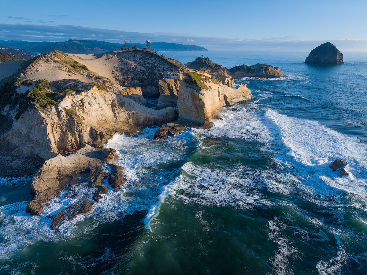
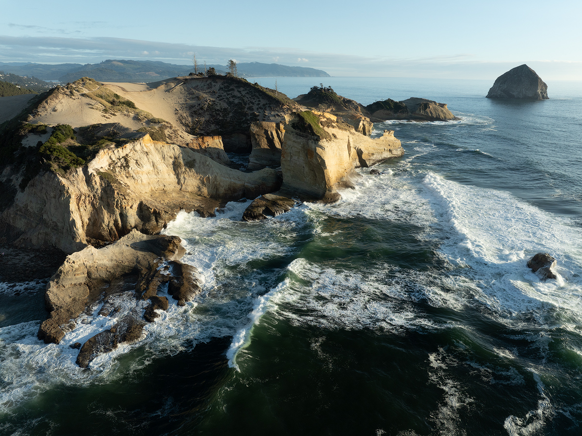
This image was shot with my DJI Mavic 3 Classic. This is another image of Cape Kiwanda near Pacific City on the Oregon coast. In the top right corner is the "other" Haystack Rock (the more famous one is in Cannon Beach).
Camera settings: 24mm equivalent focal length, ISO 100, f/5, 1/60. I believe I had a polarizer on. The original .dng image was processed through DxO PureRaw.
I adjusted the WB to the cool side, increased color saturation and vibrance, adjusted shadows and highlights, and created a mask on the sky to reduce exposure and highlights. I used the remove tool to make some minor changes.
11 comments posted
Hi Patrick, nice seascape image. I think the two main points of interest are the two islands and not so much the background land. Not being there I don't is this is possible, but if you could get a position where you have clear sky behind main island making the pine trees on top stand out more it would enhance the image. Otherwise good light on the rocks and surf, well done. Posted: 10/08/2025 15:51:56
Hi Richard, I agree that my POV could have been a little lower, so that the trees don't blend with hills in the background. Next time! Posted: 10/11/2025 06:09:20
Hi Patrick. Although I like the changes in the water in the lower half of the image, I'm not sure I like the color adjustments in the top. The hills take on a somewhat pinkish color, and you lost some of that hazy morning look on the horizon. The softer shadows and colors in the hills tone down the "pop" you are getting with the original colors in that area. And the blue background reduces the depth in the photo. It is a beautiful photo, but I think you could do better. I feel much more emotion in the top half of the original!
Rather than global edits, target in on the different areas. The blue sky is pretty, but as it approaches the horizon, don't cover up the haze.
Also, it looks like you might have leveled up the image a little, but it still seems to be leaning to the right.
Posted: 10/09/2025 15:22:27
Rather than global edits, target in on the different areas. The blue sky is pretty, but as it approaches the horizon, don't cover up the haze.
Also, it looks like you might have leveled up the image a little, but it still seems to be leaning to the right.
Posted: 10/09/2025 15:22:27
Drema, respectfully, I agree with some of your suggestions but not all. I did not want the bright background sky to compete with the sandstone cliffs. So I did a quick edit with a brush and decreased the exposure in the top of the image. I probably could refine that a little, and maybe brighten up the top of the sandstone hill a little, but I don't want the sky to be as bright as the cliffs.
When I did the initial processing, I was most concerned about blowing out the highlights (especially in the waves), and lightening up the shadows, but I think I ended up with overall contrast a little low.
I did a global WB adjust to the cooler (bluer side), and increased the magenta slightly. I agree that resulted in some pinkish tones in the tops of the cliffs. I can fix that!
Yes the image is tilted. Grrr.
Thanks for the feedback, and I'll work on this some more. Posted: 10/11/2025 06:29:00
No problem that you don't agree. It's all opinion anyway. I understand what you mean about not wanting the brighter luminosity in the sky. I think it is more the color than the luminosity change that I objected to. And I like the blue color at the top of the sky. Try using a reflected gradient along the top of the hills and along the horizon to bring back some of the original color. I think the yellow color of the hills is better against the blue, since they are opposite colors on the color wheel. I see you brought out some of the detail in the shadow behind that rock, and that was good, but beware of losing the contrast there. Posted: 10/11/2025 22:50:52
Thanks for the further comments, Drema! What is a reflected gradient? Posted: 10/12/2025 04:48:12
It is what Photoshop calls the gradient that fades from nothing to max and then back to nothing again (instead of the linear gradient that goes from nothing to max gradient).
I wish Lightroom would do this gradient with its masks, but the only way to do it in Lightroom is to place a very wide and narrow radial gradient across the entire image. Posted: 10/12/2025 16:37:24
I wish Lightroom would do this gradient with its masks, but the only way to do it in Lightroom is to place a very wide and narrow radial gradient across the entire image. Posted: 10/12/2025 16:37:24
Thanks for the explanation, Drema! Posted: 10/26/2025 18:20:04
Great photo. I like this veiwpoint very dramatic. You have no fear of water nice work. Posted: 10/17/2025 21:35:36
Beautiful place... I was bummed I wasn't able to get to Cannon Beach or anywhere oceanside when I was in Portland for the PSA conference... I would like to see how large this rock formation is... maybe a higher vantage point, to show the water all around it. And I always like the straight down shots... any of those? Posted: 10/26/2025 21:30:28
Hello Patrick, I think this is a great image. I love the colors and dramatic subject. Personally I think that if the image was taken from a higher altitude then perhaps there would not be a merger of the trees and the land in the background. Regardless I really like the image and I think you did a good job to minimize the trees and background intersection. Posted: 10/26/2025 23:11:30