Marti Buckely
October 2025 - Poinsettias
Original
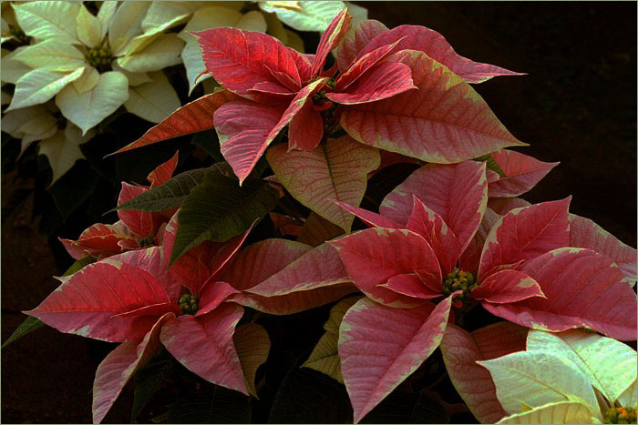
About the Image(s)
I brought the original into Lightroom and made correction to the exposure, contrast and a couple of others in the Basic correction section. Then I added the stroke.
7 comments posted
Marti, great colors with fall definitely in the air. I see you really underexposed the original and had to bring exposure and colors up to speed. Nice job. My overall impression is that there is no subject to focus on, in fact, my eye travels to the empty space between the three primary flowers, primarily because it wants to go somewhere and never rests on anything. Just my take. Posted: 10/07/2025 22:10:40
Marti I especially like the variegated red yellows in the center. I'm not as fond about the yellow/white leaves at opposite corners of the image. They bring my eye to those corners and out of the image without staying with the center image. I also would have made the red/pinks a little more saturated or darker, but that's your call. Posted: 10/10/2025 00:29:27
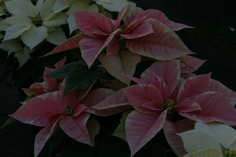
This was the one I had originally thought to send in. I thought it was a little too "overdone" and sort of wanted to get rid of the dark plants in the corners. Posted: 10/11/2025 06:06:59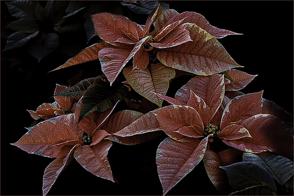
Hi Marti. I like your composition with the red leafed plants framed by the cream colored leaves to create a nice diagonal composition. My suggestions would be to (1) darken the cream colored leaves so they do not draw the viewer's attention so strongly, (2) add a touch of vibrance to the red leaves to make them "pop" a bit more and (3) add a bit of space at the bottom edge so that the bottom leaves do not touch the edge of the frame. The third item may require a bit of reconstruction editing to finish off the tips of the leaves on the edge. This might make a very nice Christmas card! Posted: 10/19/2025 18:57:45
Hi Marti, I'm at two minds about this image. I agree with Bob and Ingrid about toning down or softening the cream coloured leaves and allowing the space around the red ones to make them pop more. However, I do like the cream coloured leaves as in my mind they complement the red leaves and provide a diagonal line from top left corner to bottom right leading the viewer to explore the whole image. I would have liked to see a full leaf creamed coloured part. Lovely composition. Posted: 10/23/2025 10:07:55
The composition is very good. I like the cream colored leaves. Perhaps the red leaves could be a bit brighter. Posted: 10/24/2025 00:53:09
Hi Marti,
Greetings my friend.
Apology for delay comment this editiin.
I loved the editing from the original image. The background black color is appropriate for the subject I believe. The colors of the final outcome looks great than the original one. Thank you for your editing skills.
Thank you for sharing.
Cheers.
Kamal. Posted: 10/24/2025 09:27:15