Frans Gunterus, QPSA
October 2025 - Alaska
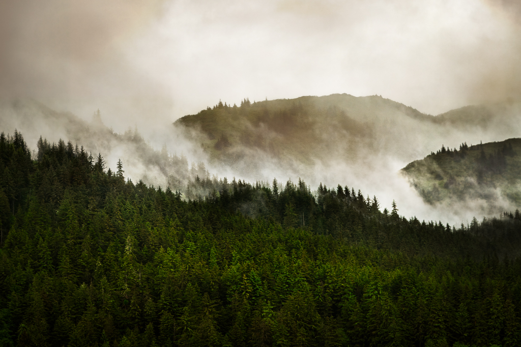
About the Image(s)
Canon EOS 6D M2, 1/400 sec at f/4.0, ISO 100. Canon EF 24-105mm f/4 L IS USM @ 88mm. Post Process in Lightroom and Photoshop.
10 comments posted
I think the image has a nice feel to it. I was curious if you cropped the image very much. The dark green trees backed up by fog (near ridge) seemed a bit sharper than the distant ridge on the horizon. I guessed that the near ridge may be about a city block away, and the distant ridge possibly 3 blocks. Focusing on the near ridge and not cropping, the distang ridge would be slightly less sharp at 88mm and f-4. With a modest crop (to 2/3 by 2/3 => down to 11MegPixels), the difference would be more noticeable.
In any case, I like the feel the photo exudes! Posted: 10/10/2025 22:18:33
In any case, I like the feel the photo exudes! Posted: 10/10/2025 22:18:33
Please review my response to Pierre. Posted: 10/14/2025 05:47:01
Hi Frans, Like Jerry the difference in sharpness between the near trees and the far ones was really noticeable. I first thought that this was due to the smoke between the hills which is dark at the top and lighter at the bottom. From Jerry's comments, it appears those clouds may be fog- but it's not obvious the reason for the clouds and why they may be obscuring both the clarity and color of the distant hill and trees. Also, the subject or object of the photo isn't really clear: is it the trees in front, or the clouds, or....? Posted: 10/10/2025 22:45:15
Please review my response to Pierre. Posted: 10/14/2025 05:47:11
Hi Frans,
Lovely and moody.
Following the conversation above, I believe that a few factors are in play: - f/4 at 88 mm is probably responsible for some of the decreased sharpness of the darker mountain in the background. - The clouds might also have a role in this difference.
This image reminds me of Leonardo da Vinci paintings: He was purposely darkening, and slightly smudging the backgrounds to increase the sense of perspective/depth.
Here we go.... Great image - another keeper! Posted: 10/11/2025 00:10:05
Hi Pierre. You got it! What an awesome analysis. You convinced me of your seasoned experience in landscape photography. :) I make my own experiment here. I was inspired by PAINTERLY PHOTOS by Nigel Danson. Instead. I used two superimposed images. I applied so many local contrast adjustment dodging and burning certain areas to increase the sense of perspective, depth and mood. You nail me down Pierre. I really appreciate it! Posted: 10/14/2025 05:46:32
Hi Frans,
You are very kind.
As mentioned before, we are all learning…. I like being inspired by classic painters! Posted: 10/26/2025 14:33:01
You are very kind.
As mentioned before, we are all learning…. I like being inspired by classic painters! Posted: 10/26/2025 14:33:01
Good to see your image Frans and the way you constructed it. I think all has been said by all and I do agree with them. Good on you for making the effort. Posted: 10/14/2025 09:12:10
Hi Geoff, thanks for your kind comments. Posted: 10/16/2025 01:24:21
Hi Frans
Thank you for your photo, I have not learned enough to make post editing in photo shop and light room to make any suggestions. My first submission I used Lightroom for the first time, but all mine have been transferred from my camera through Nikon bridge to my phone for my submissions. Once I learn more in those areas I can give better suggestions. Posted: 10/26/2025 14:05:48
Thank you for your photo, I have not learned enough to make post editing in photo shop and light room to make any suggestions. My first submission I used Lightroom for the first time, but all mine have been transferred from my camera through Nikon bridge to my phone for my submissions. Once I learn more in those areas I can give better suggestions. Posted: 10/26/2025 14:05:48