Michael Laezza
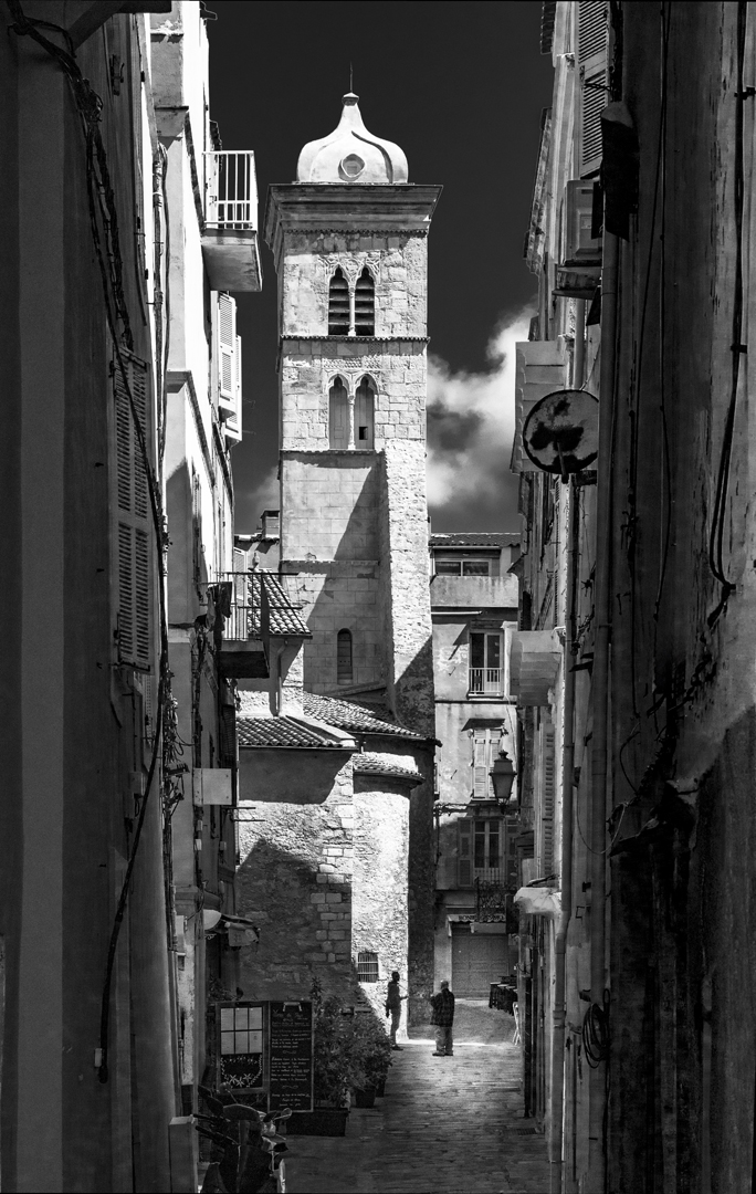
July 2026 - Greetings
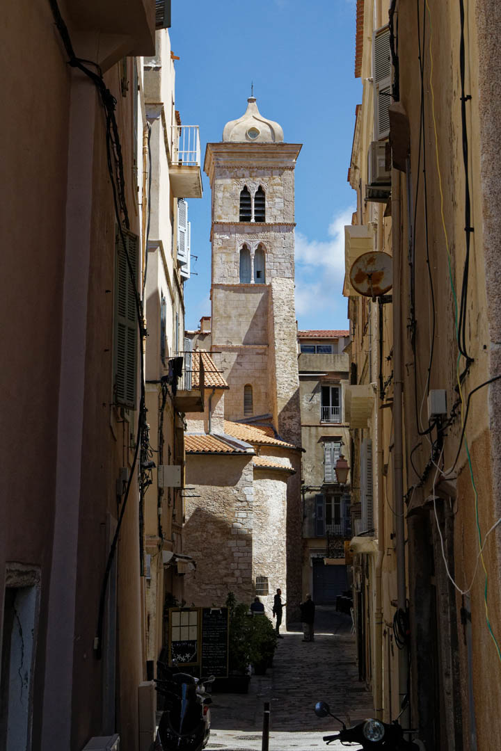
Original
About the Image(s)
I was drawn by the beautiful architecture as well as the contrasts caused by the bright sun and the interaction of the two people chatting in the distance. The processing involved mainly straightening the vertical as well as brightening the area around the two people to make them stand out more.
Technical: Canon Rebel T6s, 1/1000, ISO 400, f9,5, 24-105 lens. Processed in DXO Photolab 9.
6 comments posted
Mike, it's stunning! I love both the architecture as well as the two men. Your handling of the lighting around the men was outstanding! I played with your photograph in Camera Raw to see if a few subtle modifications might be worthwhile. I tried to make the lighting around the men slightly brighter while modifying the building lighting to make my changes seem less artificial. Also, played with the cropping, making it even "skinnier." Your thoughts?
Posted: 07/01/2026 14:36:11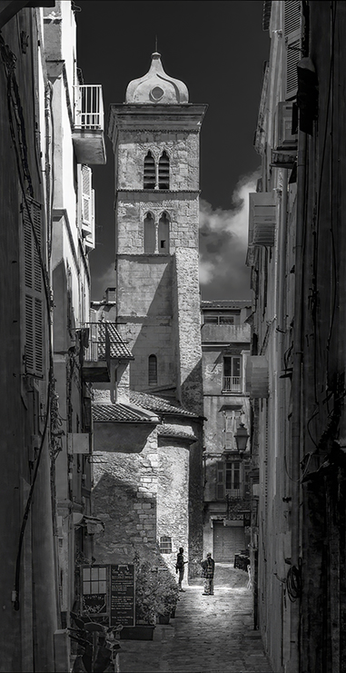
Posted: 07/01/2026 14:36:11
Thank you Pete. I like the change you made especially cropping in more from the sides. It does remove some of the distractions and focuses more on the center building and the two individuals.
Cheers
Mike Posted: 07/20/2026 00:55:57
Cheers
Mike Posted: 07/20/2026 00:55:57
Michael
I think you did very well when you snapped the shutter here.
There is so much to take in. The facade details are perfect as are the two men greeting one another.
I offer a thought what if the left and right frame edges were opened up a bit to reveal a little more detail of the buildings? I added two linear gradients on the edges, raised the shadows and exposure so the details started to appear more and the a raised the image exposure a touch and dropped the highlights there area couple of places that were too bright
well done
Emil Posted: 07/01/2026 20:47:24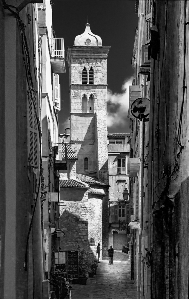
I think you did very well when you snapped the shutter here.
There is so much to take in. The facade details are perfect as are the two men greeting one another.
I offer a thought what if the left and right frame edges were opened up a bit to reveal a little more detail of the buildings? I added two linear gradients on the edges, raised the shadows and exposure so the details started to appear more and the a raised the image exposure a touch and dropped the highlights there area couple of places that were too bright
well done
Emil Posted: 07/01/2026 20:47:24
Thank you Emil - it is interesting that you prefer to open up the sides more by brightening them while Pete suggested to crop in more from the sides and focus more on the center of the image. I was concerned with showing some of the distractions on the walls on the two sides but lightening them up gives a view of what the walls actually look like.
Cheers
Mike Posted: 07/20/2026 01:01:10
Cheers
Mike Posted: 07/20/2026 01:01:10
Michael,
I like how your eyes are drawn through the image to the tower in the middle which unfortunately is not what you are trying to draw my attention to. Overall I like how you processed the image. I do agree with Emil in opening the shadows on the sides of the buildings helps reduce the framing of the tower. My eyes are being drawn to the tower in the middle and the not the two individuals. I tried a couple of things with your image and reduced the overall contrast to reduce the draw of the tower.
Posted: 07/14/2026 11:37:06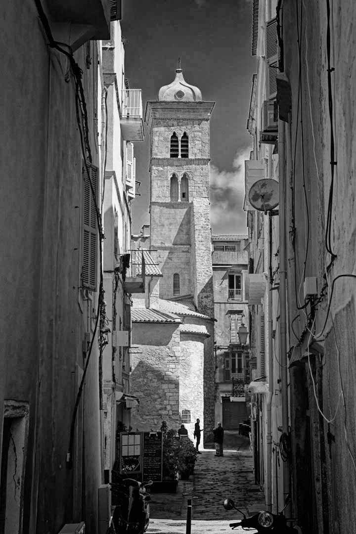
I like how your eyes are drawn through the image to the tower in the middle which unfortunately is not what you are trying to draw my attention to. Overall I like how you processed the image. I do agree with Emil in opening the shadows on the sides of the buildings helps reduce the framing of the tower. My eyes are being drawn to the tower in the middle and the not the two individuals. I tried a couple of things with your image and reduced the overall contrast to reduce the draw of the tower.
Posted: 07/14/2026 11:37:06
Thank you Chris . I do like the look that a less contrasty treatment gives to the image. It is certainly a very worthwhile alternative and i like it very much.
Cheers
Mike Posted: 07/20/2026 01:05:49
Cheers
Mike Posted: 07/20/2026 01:05:49