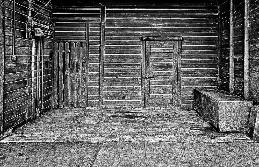
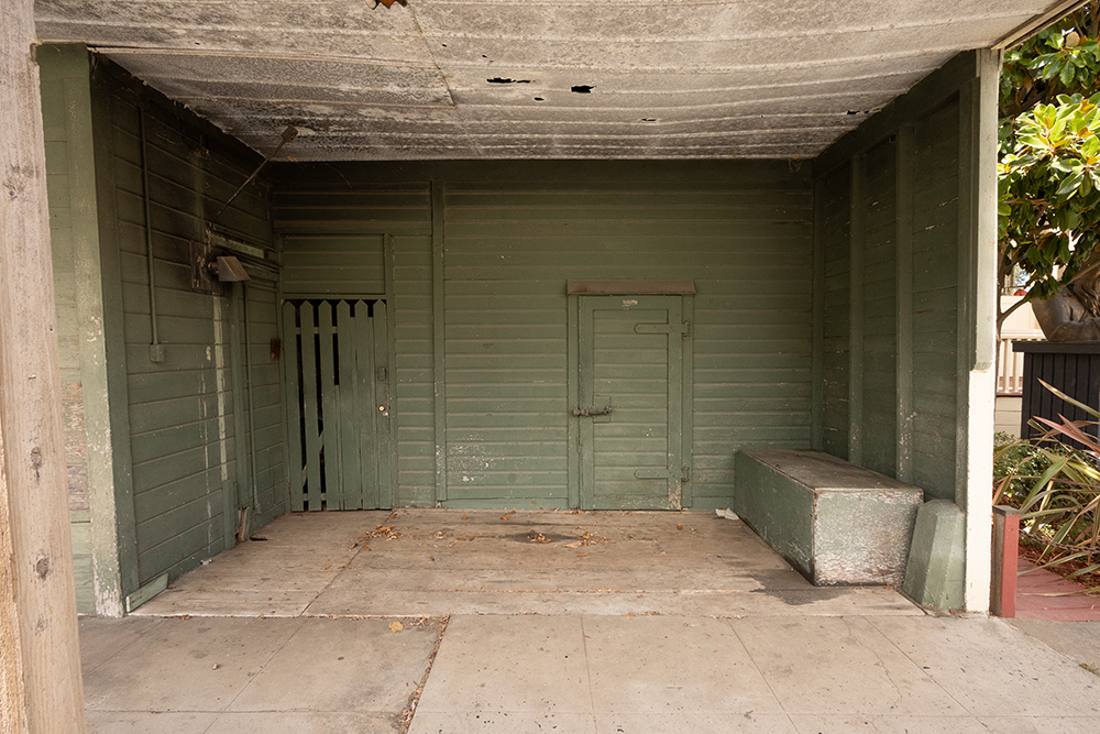
Most of my architectural stuff in exterior shots, but this month I have a sort of “interior” shot. This is a garage built in the early 1900’s. I do not think a modern car would fit without sticking out into the street. I liked the wood and all the textures.
So, by question is… do you like the green color and textures, or is it just a… Garage, and boring. When I look at a photo, I say, what is the subject. In this case, it is an old Garage. I tried it in Black and White, and even though I really liked the green, I think the black and white looked more rustic. What do you think.
Shot with my Nikon mirrorless with 18mm lens. ISO 800 f11 @1/125 sec. Edited in Adobe Camera Raw and Photoshop with help from Nik Silver Efex Pro.
6 comments posted
Henry Roberts
Don, I think you nailed it with the conversion to black and white and some post processing. Cropping out the bicycles was a good idea. Nice image! Posted: 10/09/2025 19:13:47
Julie Deer
Hi Don, Even though I enjoy black and white photography, I think I like the coloured version better. I like the way the walls are green but the ceiling and floor are not. It helps guide the eye to the interesting parts of the garage. Posted: 10/12/2025 06:52:48
Stephen Levitas
(Group 32)
You made an interesting composition from your source material. All the changes worked well, cropping, monochrome, texture. It became a study in emptiness, with all the thoughtful, almost Zen, meaning of that implied. I keep looking at it again and again, which for me is the test of a good image. I am enticed to wonder what is behind the bolted door. Did you try including some of the roof? I see from your bio that this is your specialty. Well done. Posted: 10/13/2025 17:13:14
Janice Solomon
Hi Don, I like that you used black and white, and I think the crop was well done. It might need a little bit of straightening. You might want to reduce the texture a bit to make it look more natural. You could lighten or darken the door to have a place for the eye to rest. Posted: 10/17/2025 01:32:29
Catherine Honigsberg
Hi Don, I really like the monochrome conversion - it think there is more a story there. I would try to include the roof it gives it depth and pulls you in. It think a touch of straightening would keep your eye moving more. Good find! Posted: 10/17/2025 14:46:15
Andrew Hersom
I suggest cropping out some of the empty foreground. Personally I prefer the coloured version. The suggestion to include some of the roof is worth considering. Posted: 10/18/2025 12:57:42