Vincent Cochain, MPSA
July 2026 - The Dancer
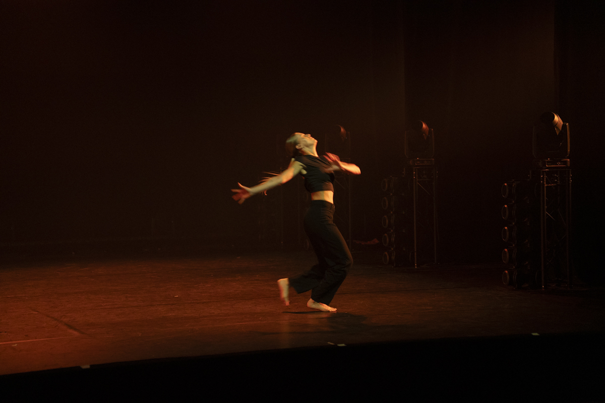
Original
About the Image(s)
Technical: 1/160, f/2,8, ISO 6400 at 88 mm (FF).
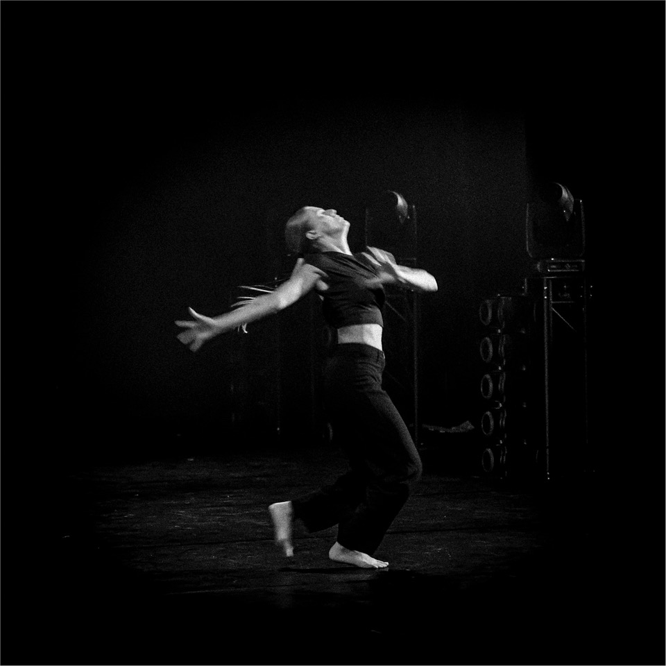
I already sent some images of Dance. One more... May is the month of spectacles. Not always easy as sometimes they is low light and movement.
Working settings: Always ISO auto with a max of 6400. I opened as much as possible (f/2,8 in this case), and I hope to have enough speed, even if I am under exposed. In this case, I made a mistake, speed is too low (1/160) and there is some motion blur. I said, ? bad picture, unusable ?. However I liked the attitude (position of the arms and dead) and I tried to use it.
LR: Cropped (square format). Decreased Hightlight - Increased Exposition Texture and Dehaze. B&W auto. After I tried new settings (Vignette -100, Grain + 100: Max for both). I used a mask on the background (Texture + 54, Clarity +100, Dehaze + 50). The aim is to give a special texture at the image to use the blur motion as a positive element to try to create an old picture.
At the end, this is my favorite picture of the spectacle. (Possible to see other pictures on this site: https://www.flickr.com/photos/141673813@N04/albums/).
In addition, when seeing this picture I think, just a little bit, and with modesty, at a famous picture of the 30’s in Spain taken by an American photographer…What do you think about that? Thanks.
11 comments posted
I'd like the square crop, but I wonder what the image would look like if you've kept more of the rectangle and allowed that light coming in from the left-hand side to stream across the bottom of the image I don't know how it would show up with a black-and-white, but it might be interesting. Nice image! Posted: 07/05/2026 21:53:59
Good remark about the light, also done by others. I will try to keep this light. Posted: 07/14/2026 15:07:53
I was surprised that the interesting side lighting of the it doesn't repeat in the mono - was this deliberate? It should add additional interest rather than distracting. Do you need so much space above the dancer and to left, especially as there is no detail there? Posted: 07/08/2026 15:31:13
Indeed this image can have some improvement. The square format that I like is may not the more appropriate. Posted: 07/14/2026 15:09:06
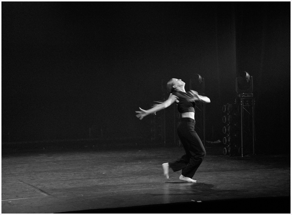
Indeed the light in the back is better. And you kept the shadow on the ground. Well done Mary Ann.
I have to work again on the picture. Posted: 07/14/2026 15:12:54
I agree with your choice of the Mary Ann's version.
Posted: 07/14/2026 15:16:33
Now called Dancing to the Lights. lol Sorry just had to saw theis as soon as I opened the image. Posted: 07/15/2026 09:50:33
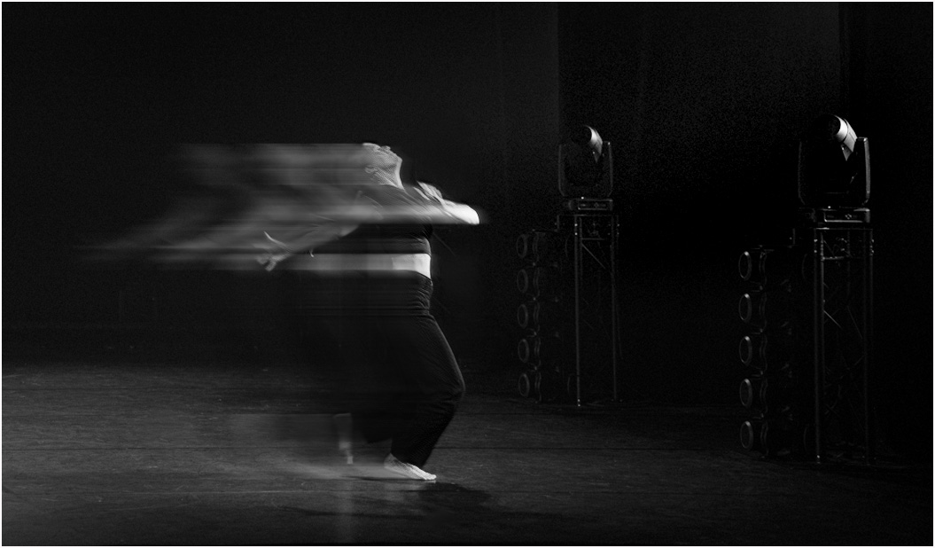
I still have a lot of things to learn (in PS). In fact I can't use it... Posted: 07/15/2026 15:07:43