Jan Handman
October 2025 - Eccentric Millinery
Original
Original 2
Original 3
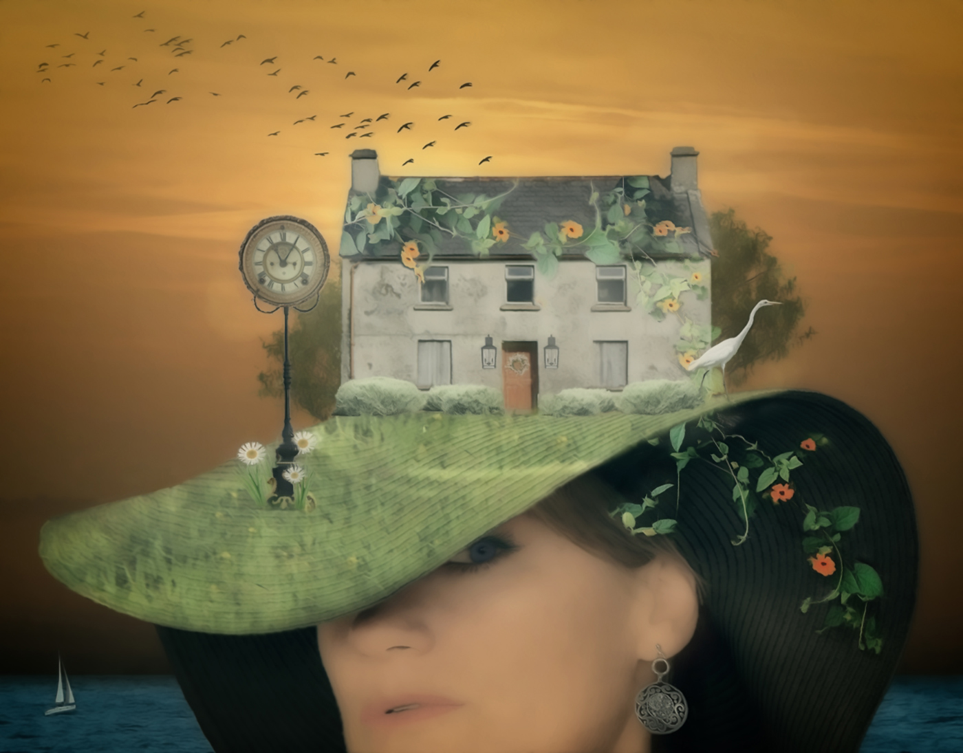
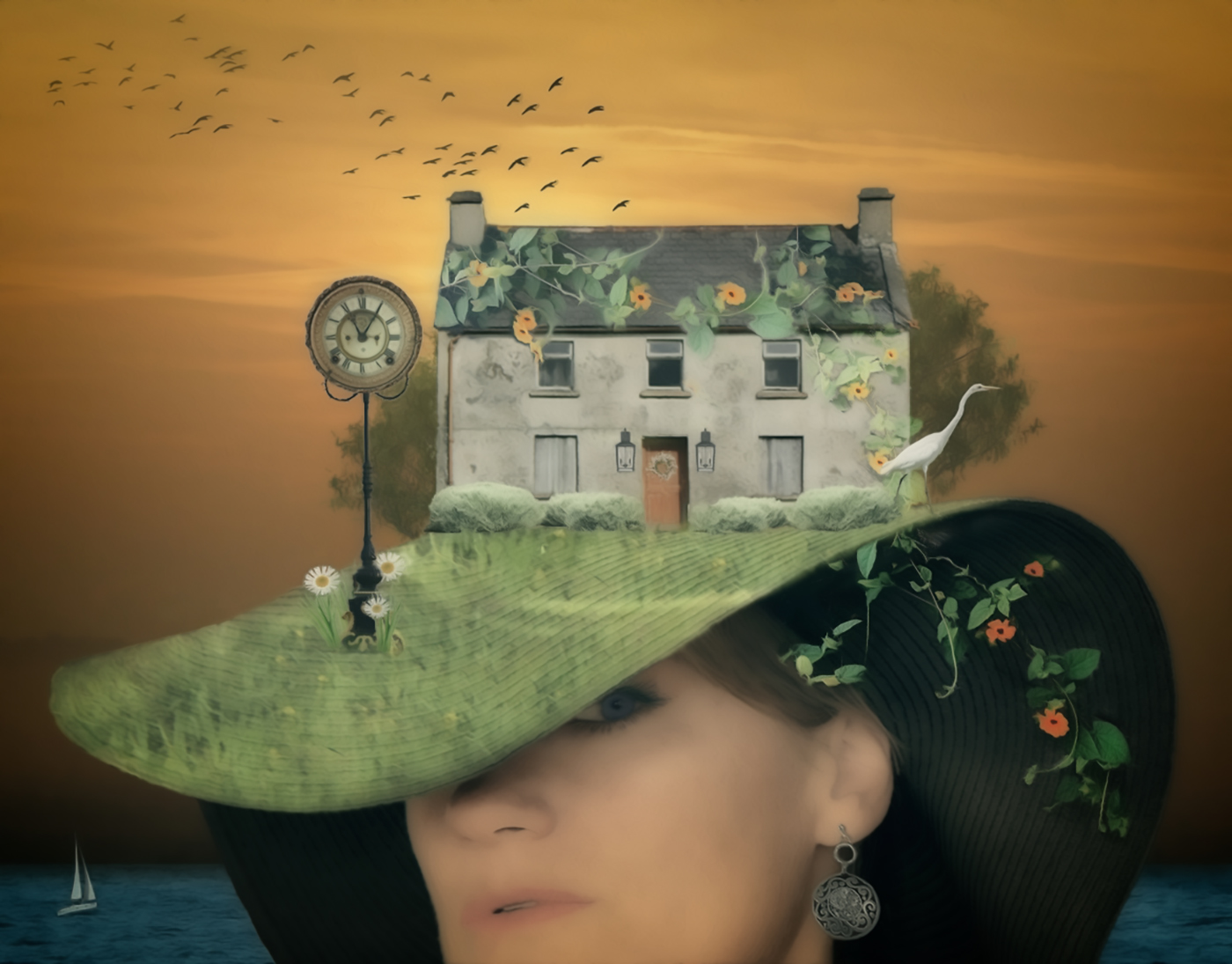
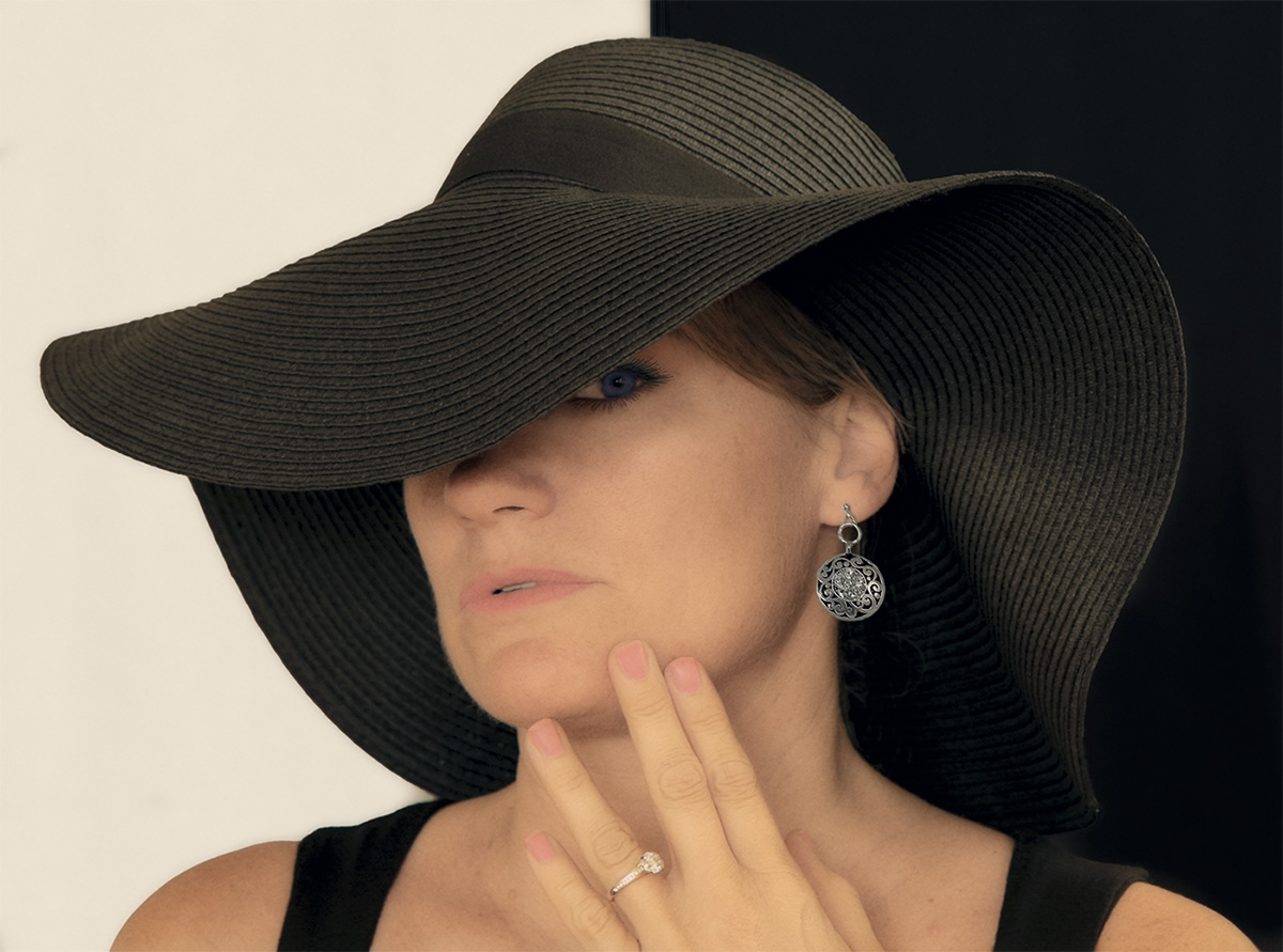
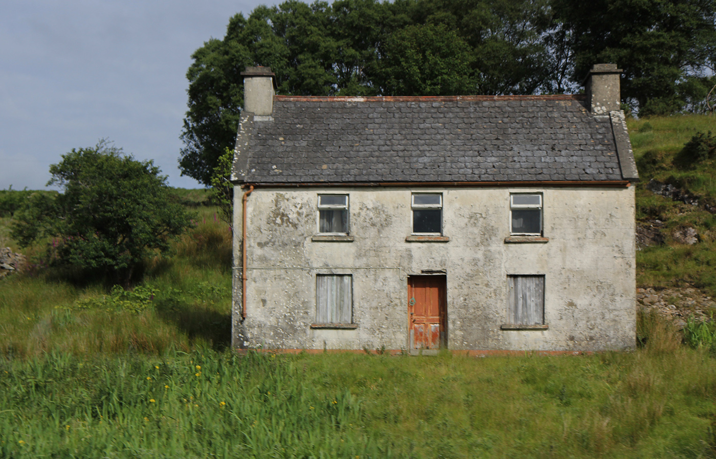
About the Image(s)
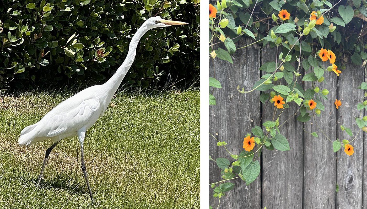
Just a bit of surreal silliness this month. I opened a few photos that were just sort of random picks from my photo stash -- my daughter-in-law, the house, and egret -- to see if I could combine them into a scene with unrealistic scales of size. I placed the house in the position of the crown of the hat and duplicated the lawn area to cover the upper brim. I decided I needed to keep the straw texture of the brim, so I changed the blend mode of the lawn to Linear Dodge. I added the vines going across the house and down under the hat to connect the two parts. My original intent was to just use the three elements to keep things simple, but it seemed sort of boring, so I kept adding stuff until there were more details to look at. A very subtle Oil Paint filter was used after I flattened all the layers. After I finished in PS, I switched to On1 and added Soft Black Glow, Vintage Ocean Waves, and Big Softy Vignette at various different opacities.
3 comments posted