Denise McKay  


Last Gasp by Denise McKay

March 2024 - Last Gasp

March 2024 - Denise McKay

Original

About the Image(s)

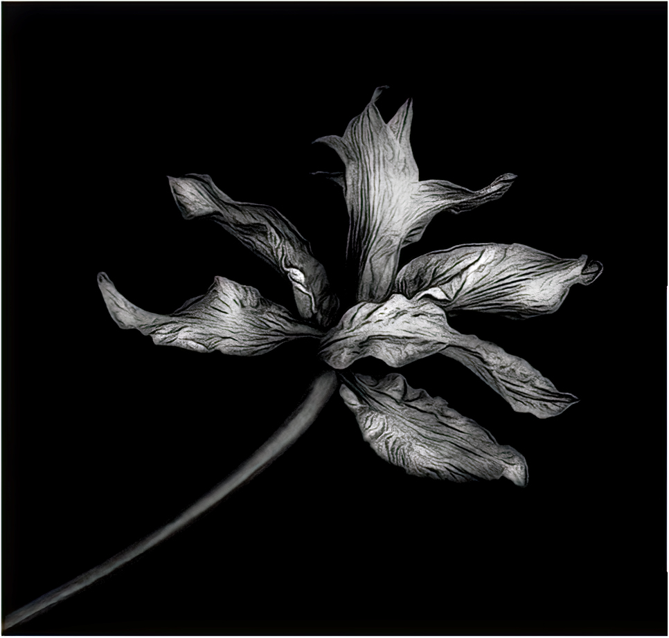
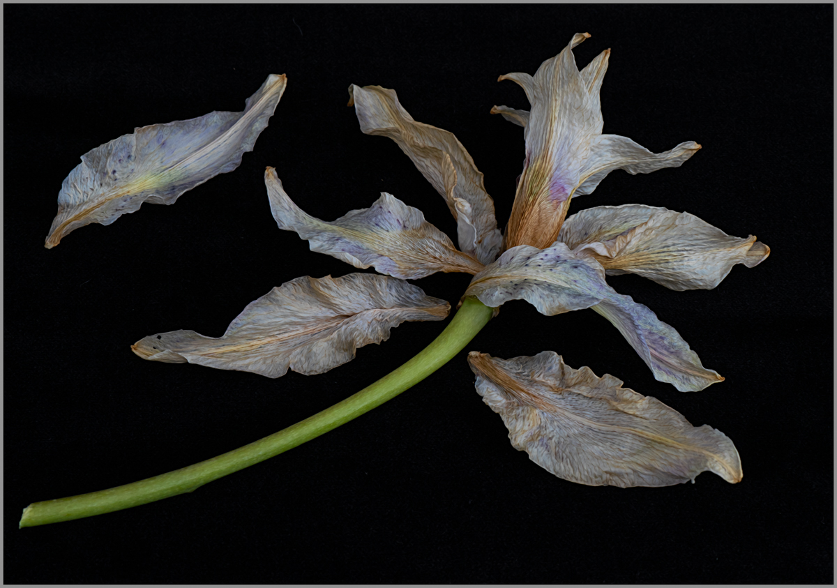
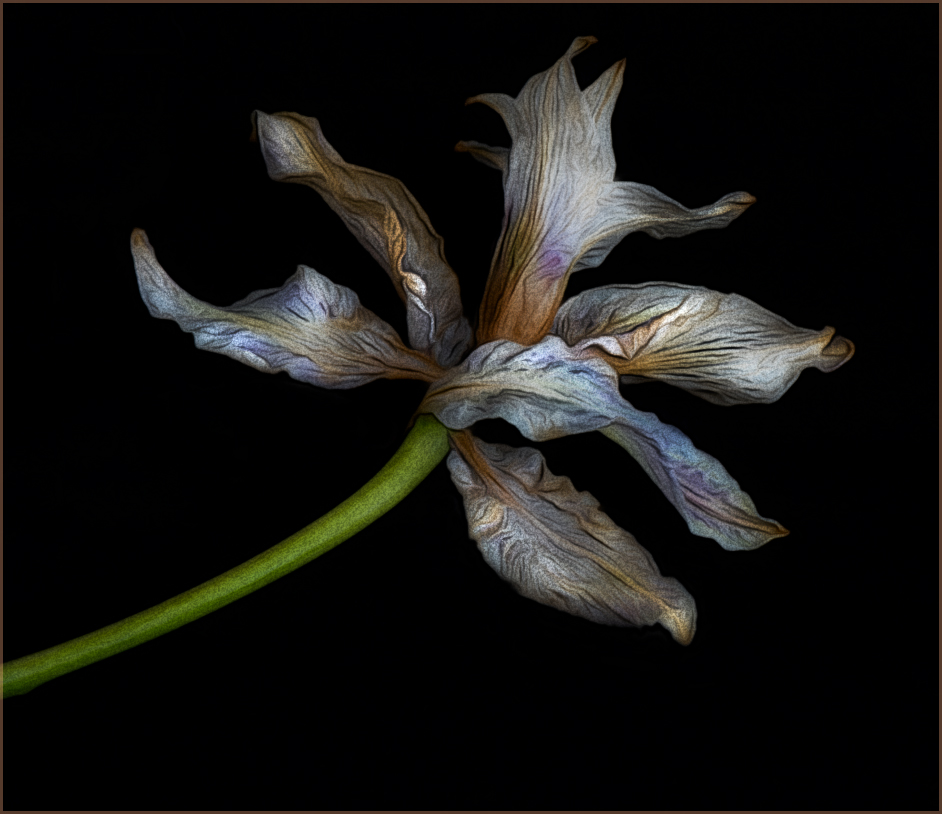
This was a flower I used in a photo project for an online workshop I'm taking. It was in full bloom then, but now was dying and falling apart. As I was picking up the pieces to throw them away, they struck me as still having a beauty to them that was worth capturing. So I arranged them on some black velvet and made this image.

Taken with my Sony A7R IV, 70 - 200 macro zoom lens at 70 mm, f14, ISO 500, 1/8 sec, on a tripod, in natural light coming from a large sunny window and using a white foamboard to bounce additional light.

In Lightroom I did the following:

- cropped closer
- removed some spots on the fabric
- increased exposure, texture, and saturation

In Topaz Studio II:

- added the Smudge filter and adjusted it to my liking for a subtle painterly effect

In Photoshop - added a thin stroke around the edges

As this was kind of like setting up a still life, I struggled with knowing if I had enough pieces of the flower in the composition or if I overdid it. Your feedback will be much appreciated!


This round’s discussion is now closed!
11 comments posted


Angela Bonner   Angela Bonner
(Groups 20 & 81)
Lovely shot. Just the kind I attempt to produce. Dead flowers make great subjects!!
Check out the Wabi Sabi webinar available from this site it is a great watch and all about dead flowers!!   Posted: 03/08/2024 11:33:05
Denise McKay   Denise McKay
Thanks for your feedback Angela! I will look for the webinar.   Posted: 03/09/2024 13:02:17


Connie Reinhart   Connie Reinhart
You have just the right number of petals. The loose petal adds a lot to the story of the fading flower. The tones are gentle, the lighting soft. You did a beautiful job. Just out of curiosity I changed the position of the loose petal. It makes a slightly different image, but not really better.   Posted: 03/08/2024 13:33:54
Comment Image
Denise McKay   Denise McKay
Thanks for your feedback Connie. And for the visual example of another idea. Appreciate it!   Posted: 03/09/2024 13:03:14


Georgianne Giese   Georgianne Giese
This is a lovely image of a flower. I do love the way you pulled out the gold and lavender tones. Like the others have said, in my opinion you have just the right number of petals. I also like Connie's version, with the one petal position changed. I think the changed position of the petal offers an appealing diagonal line in the image.   Posted: 03/13/2024 12:42:59
Denise McKay   Denise McKay
Thanks Georgianne!   Posted: 03/13/2024 16:19:39


Jan Handman   Jan Handman
I hate to be of a contrary opinion, but it seemed to me there were more than enough petals to tell the story. Wondering if I was off base, I decided to see what I came up with in removing two of the loose petals and moving the third one to appear to still be attached to the stem. At that point it seemed a different crop was in order. Then, since I was having a great time working with your lovely piece, I took it into PS Filter Gallery for Poster Edges and Oil Paint. Then into On1 for a glow effect. And finally, a little dodging of the highlights and burning of the shadows. I also added a keyline border using the brown color from the flower. Your image is lovely and I didn't start out intending to change it so radically; I just couldn't stop myself. :)   Posted: 03/13/2024 18:04:43
Comment Image
Denise McKay   Denise McKay
I love what you've done here Jan! I think you helped me discover another way I could have looked at this image as I was pondering the petal arrangement.

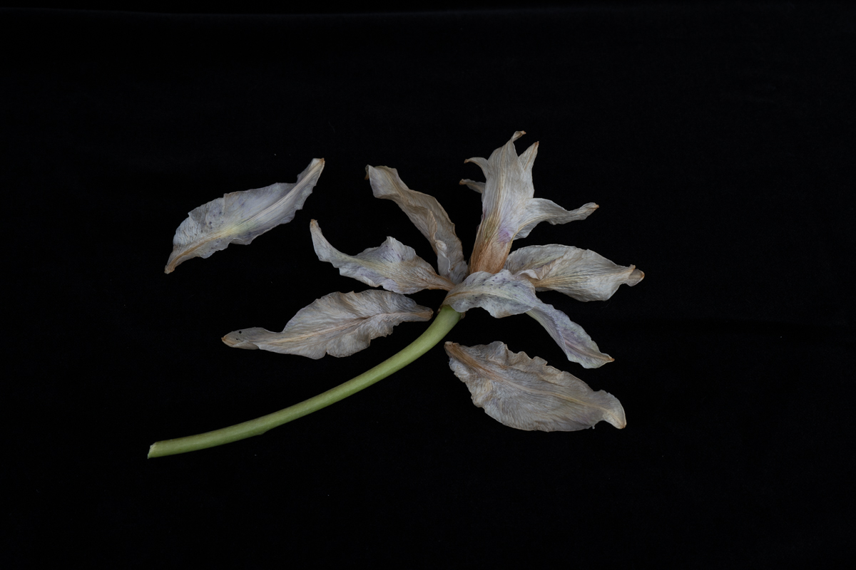
I felt my initial crop left too much room at the top left, therefore I added that petal. I liked seeing the full stem, but now I like your crop as well! Making that crop and using less petals worked really well.

Thanks for taking the time to work on this!
  Posted: 03/17/2024 10:22:27


Linda M Medine   Linda M Medine
Denise, I really love your image. When I first looked at it, I thought it would be beautiful too in Black and White. After Jan put her visual feedback. I thought I really like her feedback too. So, I have the image with more space and the flower at more of angle and Black and White. I find the green stem is a little too much contrast. But, I love the image and the way everyone has viewed it so differently and all look great to me.   Posted: 03/17/2024 16:46:40
Comment Image
Denise McKay   Denise McKay
This is really interesting too Linda! The only thing I might change is not having the stem come directly out of the corner. But I like this version as well.   Posted: 03/17/2024 22:05:02


Connie Reinhart   Connie Reinhart
Photographers are lucky. We3 can have dozens of versions of a single image very quickly. Painters would have to start over from scratch for each version.   Posted: 03/21/2024 12:59:32