Mike Cowdrey, MPSA
March 2024 - The Triffid
Original
Original 2
Original 3
About the Image(s)
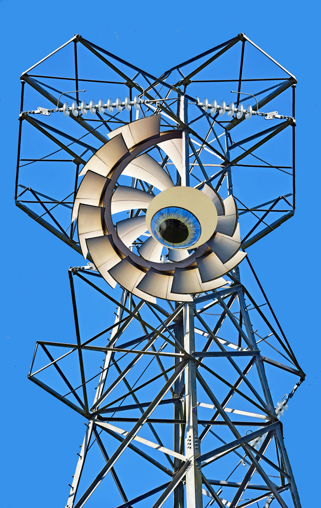
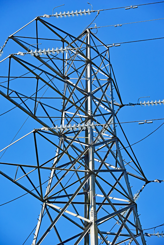
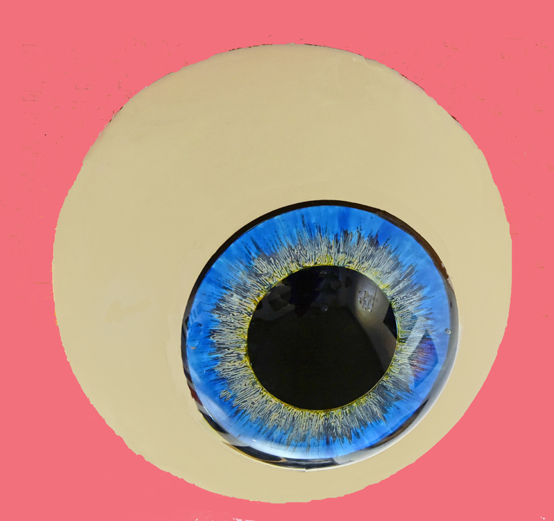
Original 1 is a shot of an electricity pylon. Original 2 was from many years ago of a model eye, taken at an optical exhibition which I attended with my optician daughter. Original 3 was a shot from part of one of the interesting
buildings at Nottingham University Campus which I treated to a polar co-ordinate filtration. The three elements were then combined using cut and paste. The unwanted struts of the pylon were cloned out, and the top left section was copied using the polygon lasso tool, reversed, and pasted to the right-hand side of the image.
The result reminds me of a combination of the alien invaders in H G Well's War of the Worlds, and in John Wyndham's Day Of the Triffids!Be afraid!
This round’s discussion is now closed!
8 comments posted
How "1984"ish - big brother is watching! Nicely composited. Very creative, Mike. One suggestion - make the ""Eye" piece a bit larger to block out more of the top of the tower. As well, to support your Be Afraid message, you could also replace the happy, blue sky with something more threatening. Posted: 03/03/2024 11:17:40
I did a mono version and couldn't decide whether to use it instead. More threatening? Posted: 03/04/2024 13:39:10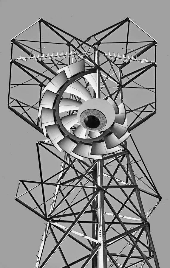
This is a very cool image Mike. I really like the way you simplified the tower; the concept of the threatening eye is great. I prefer the color version over the monotone, so that the eye is more prominent and obvious. I couldn't resist the urge to play with it for fun. It sort of seemed to me that the outer part of the eye needed to be rotated a bit so that the "lashes" were on top. I liked Gunter's suggestion of making the eye a bit bigger too. After placing the revised eye over the tower, I used Nick ColorEfex, Midnight, and Vignette filters to make it a little more dark and threatening. I love your imagination in creating this. Well done! Posted: 03/08/2024 13:12:07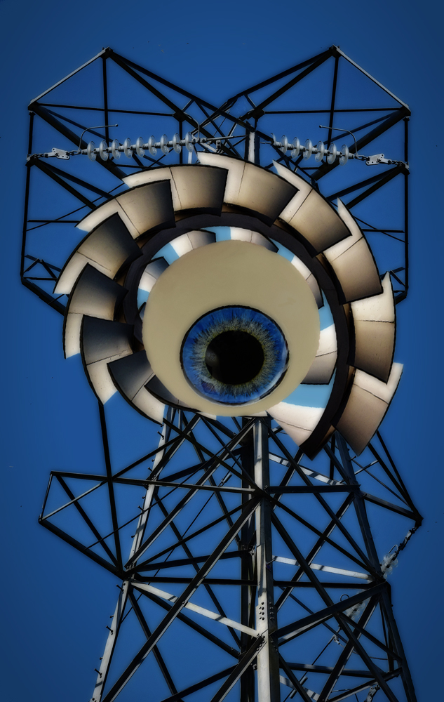
Good job constructing the image, Mike. I also prefer the color version. The eye pops better. You did a good job of simplifying the tower. I agree that a more foreboding background might work. A lot of work with good results. Posted: 03/11/2024 15:09:32
Hi Mike. It's a unique design. I like your idea of mirroring the tower to create a unique metal works. I think Jan enhanced it nicely. Posted: 03/11/2024 23:58:30
I think this is excellent. WEll thought through and well executed.
Having seen the previous comments, I like the idea of combining the monochrome with an enlarged eye in colour. I've also changed the background using a clouds image, a gradient and zoom blur. Some people just don't know when to stop, but I couldn't resist! Posted: 03/19/2024 18:12:50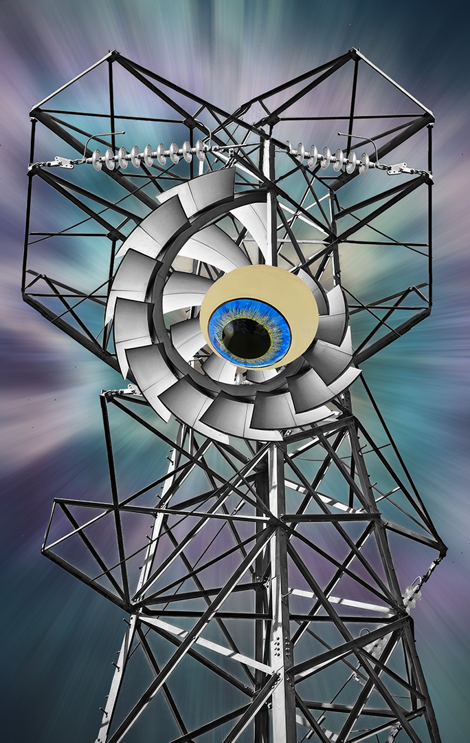
Having seen the previous comments, I like the idea of combining the monochrome with an enlarged eye in colour. I've also changed the background using a clouds image, a gradient and zoom blur. Some people just don't know when to stop, but I couldn't resist! Posted: 03/19/2024 18:12:50
(Group 40)
Very neat idea and got to say I like this a lot. How to improve? I must say I think Steve's version is nicer. Posted: 03/23/2024 14:23:21
I think the eyeball should be larger. I like the monochrome best. It looks more congruent. I'd probably love a monochrome version of Steve's enhancement. Posted: 03/30/2024 13:13:48